With the new Performance Tree Map, you get a visual overview of market activity – or your own portfolio. At a glance, you can see which stocks are performing particularly well today, which are in the red, and how everything is distributed across sectors.
The Tree Map is a data-driven visualization that helps you immediately recognize patterns and outliers – without long lists or tables. The size, color, and grouping of the tiles give you all the important information at a glance.
The best part: You can use the view for both the overall market and your personal portfolio.
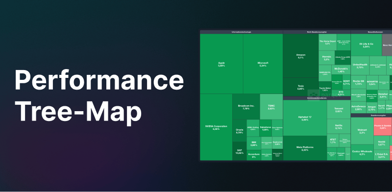
1. The Performance Tree Map for the Overall Market
You can find the view directly on the Markets page. This feature is available to all Parqet users. Here you get a compact overview of:
- The 150 largest stocks by market capitalization.
- Automatically grouped by sectors.
- The size of the tiles represents the respective market capitalization.
- The color reflects the one-day performance.
This way, you can immediately see which sectors are currently in demand – or currently under pressure.
2. The Performance Tree Map for Your Portfolios
In the Analysis tab under "Returns", as a Parqet subscriber you will also find a Tree Map specifically tailored to your portfolio. The following view options are available here:
- Sorting of tiles by current value or by purchase value.
- Time period of the view sorted by today, the last 7 or 30 days, 3 or 6 months, MTD, YTD, or since purchase.
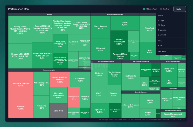
Here too, your assets are automatically grouped by sectors – so you can see at a glance which areas of your portfolio are currently performing strongly or weakly. Cash is excluded. Precious metals and crypto are separate groups, so they look like their own "sector". By the way: You can easily save the Tree Map as an image – simply right-click → select "Save image as...".
The color scheme of the Tree Map dynamically adapts to the values contained. Particularly strong positive or negative outliers stand out visually – they literally "glow". In comparison, all other values appear much paler, even if they are high in themselves.
An Example:
You have a position with a 1-year performance of +100%. Sounds strong – and would normally be displayed in bright green. But if your portfolio additionally contains a position with +500%, the +100% position appears much less intense in comparison – even though it performs excellently in absolute terms.
What's Next?
We are currently working on further optimizing the Tree Map view – both for the overall market and for your personal portfolio. In addition, we have many ideas for further development: regional filters (e.g., EU or US), targeted selection of individual indices such as DAX or S&P 500, as well as drilldowns into industries or subsectors. Additional comparison options and time periods are also on our list. Many of these extensions are planned for the medium term and also depend heavily on your feedback. We're excited to hear what you would like!
New to Parqet?
At Parqet, we work every day to remove barriers to wealth building. To do this, we build tools that make it easy for you to keep track of your portfolio, whether at home or on the go, without much effort.
See how Parqet can simplify your wealth planning, or create your free portfolio in just a few seconds.
Create Portfolio